In response to a question about the accuracy of cycles analysis or the possibility of inversion in a chart resulting from an analysis, I thought it best to post an example.
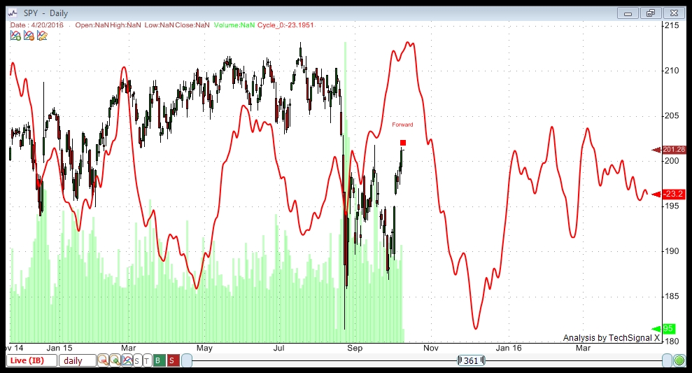
Here’s the original chart that I posted that sparked the question. It’s a chart of SPY (which tracks the SP500).
In my experience through the Foundation for the Study of Cycles, cycles don’t “invert.” Planetary signals are more prone to it, particularly around the equinox.
Therefore at the Foundation, we found planetary signals to be most accurate at forecasting changes in direction.
Cycles, in contrast, are inherent in the asset itself. In my analysis, I use at least 13 years of data. The software analyzes the data and finds the most periodic cycles within that asset.
The rule in finding cycles is that they have to have a periodicity of at least ten. In other words, they have to appear ten times in a row at regular intervals. So, these are regular sine waves, if you will, that appear historically in that asset.
What we’ve found over long periods of time is that they can “slide” in time in terms of the highs and lows, or be muted, or not seem to appear at all for a period and then pick up again. (Edward Dewey found some cycles that would seem to disappear for years only to pick up again at a later time). But this is not the norm.
What you’re seeing in the period of March to May are what appear to me to be weaker cycles that didn’t have that much of an effect on the market. I don’t see outright inversion. Visually, my weakness comment comes from the fact that their amplitude is not that great.
The upcoming cycle (in October/November) appears to me to be quite strong (the amplitude is extreme compared to the cycles ahead and behind), which would indicate to me a preponderance of tops and bottoms at those points. Each of the highs and lows reflects a compilation of the position of twenty five cycles (in this case), and so the bulk of them are coming together at exactly the same point. Whereas in March through May you would have a number of smaller cycles that were perhaps out of sync.
Let’s look at a chart that might illustrate this:
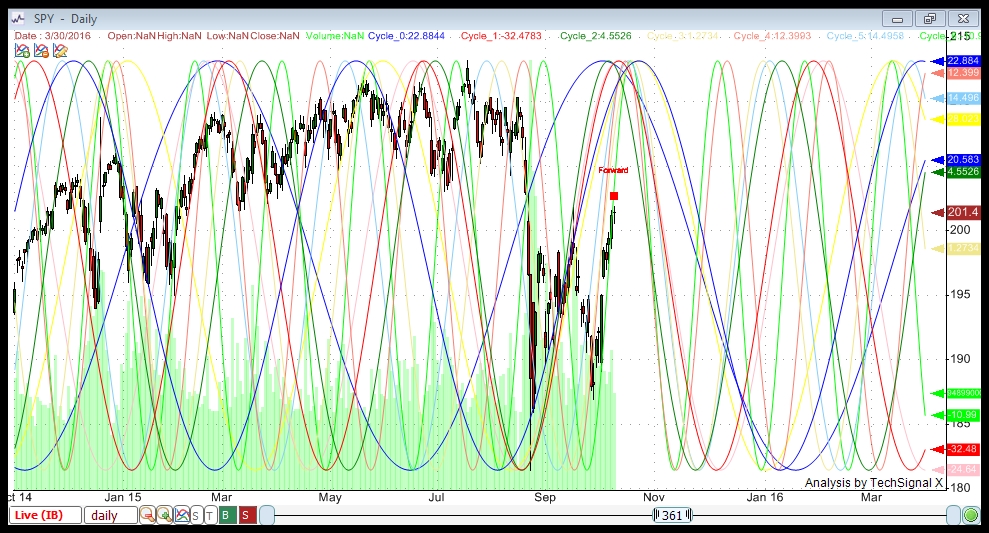
Above is the same chart with only the top ten cycles shown (but not compiled), selected by their win percentage. In other words, over the past 13 years, trading the ups and downs (going long and short at tops and bottoms) using these individual cycles produced the largest number of winning trades of all the cycles.
I selected only ten so that the screen wouldn’t be completely overrun with sine waves.
You can see during the March to April time period that there appear to be cycles moving in all directions. The software is very good at compiling these into the mathematical representation of combined strength to produce the first chart at the top of the page.
If you now look to the top in October, you can see all of the ten cycles coming together at that point. This signifies a very strong probability that this will be a top because so many cycles are converging at that point.
So my answer is that based on the strength of the cycle on screen, the probability of an influence is strong.