
Click on either chart to get a larger image.
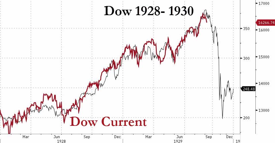 |
This is the chart that’s been making the rounds on Wall Street, but has been, for the most part, discounted. The overlay in red is from the today’s DOW and the black line is from the crash of 1929. A striking similarity. The argument seems to be that we’re in control of the markets now and with computers and deeper understanding of how markets move, something like this just couldn’t happen again. |
 |
Here’s the chart of the DOW. You can click on it to get a larger image. |